Exploring the Role of Coffee Kerning — How Visual Presentation Affects Perception of Coffee Quality
From menu typography to packaging design, discover how visual elements shape our coffee experience before we even take that first sip. The art of presentation matters more than you think!
Amazon Affiliate Disclosure
This post contains affiliate links. If you purchase through these links, we may earn a small commission at no additional cost to you.
Exploring the Role of Coffee Kerning — How Visual Presentation Affects Perception of Coffee Quality
Hey coffee lovers! It's Imani here, and today I want to dive into something that's been fascinating me lately – the incredible power of visual presentation in our coffee experience. You know how we always talk about the importance of taste, aroma, and brewing technique? Well, what if I told you that the way coffee is presented visually – from the spacing between letters on a menu to the design of a coffee bag – can actually influence how we perceive quality before we even take that first precious sip?
As someone who's spent years crafting the perfect café atmosphere and watching customers' reactions to everything from our chalkboard menu to our packaging choices, I've become increasingly aware of how much our eyes influence our taste buds. Let's explore this fascinating intersection of design and coffee culture together!
## The Psychology Behind Visual Perception and Taste
When Your Eyes Taste First
Here's something that might surprise you: our brains start "tasting" coffee the moment we see it presented. Whether it's a beautifully crafted latte art design, an elegantly designed coffee bag, or even the font choice on a café menu, these visual cues are already setting expectations in our minds.
I've noticed this phenomenon countless times in my café. When I switched from a simple, basic font on our menu boards to a more carefully crafted, well-spaced typography (yes, that's where kerning comes in!), customers began lingering longer at the menu, asking more questions about our specialty drinks, and generally seemed more engaged with our offerings.
The science backs this up too. Research in sensory psychology shows that visual presentation can influence taste perception by up to 30%. That's huge! It means that a coffee that looks premium – through thoughtful packaging, proper typography, or beautiful presentation – will often taste better to consumers than the exact same coffee presented in a less appealing way.
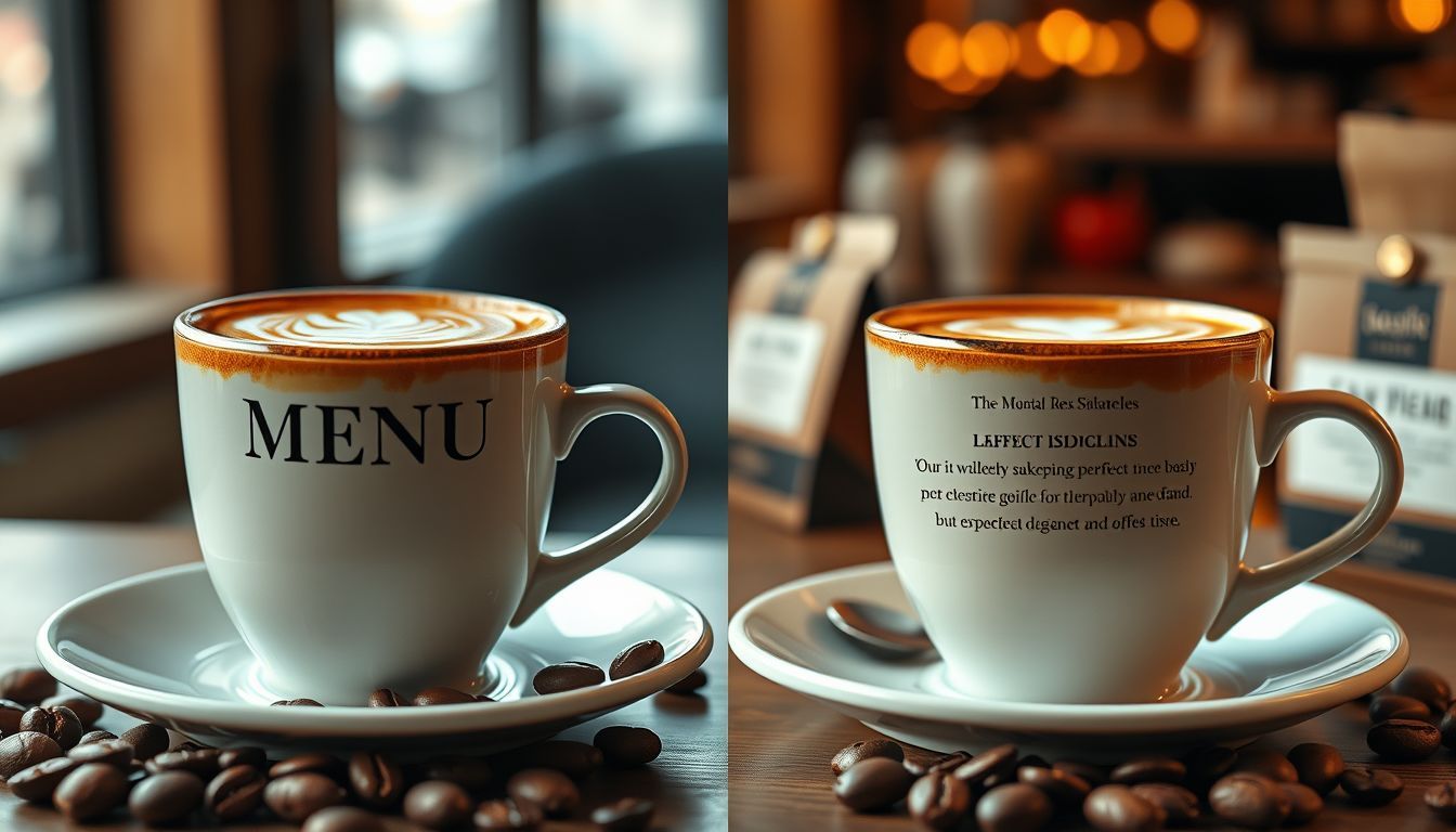
The Kerning Connection
Now, let's talk about kerning specifically. For those who might not be familiar with the term, kerning refers to the spacing between individual letters in typography. Good kerning makes text more readable and visually appealing, while poor kerning can make even the most premium coffee brand look amateurish.
I learned this lesson the hard way when I first opened my café. I was so focused on sourcing the best beans and perfecting my brewing techniques that I didn't pay much attention to our signage and menu design. The result? Despite serving exceptional coffee, some customers seemed hesitant, and I couldn't figure out why.
It wasn't until a graphic designer friend pointed out that our poorly spaced menu text was making our offerings look "cheap" that I understood the connection. We redesigned everything with proper kerning and spacing, and the difference was immediate and dramatic.
## How Visual Elements Shape Coffee Perception
Packaging Design and Brand Trust
Let's start with something we all encounter: coffee packaging. Whether you're buying beans at a grocery store, ordering online, or picking up a bag from your local roaster, the visual design of that package is already influencing your expectations.
I've worked with several local roasters over the years, and I've seen firsthand how packaging design affects sales. One roaster I know produces absolutely incredible single-origin beans, but their initial packaging was... let's say "minimalist" to be kind. Simple brown bags with basic, poorly-kerned labels. Despite the exceptional quality of their coffee, sales were sluggish.
When they invested in professional packaging design – with proper typography, thoughtful color choices, and yes, perfectly kerned text – their sales increased by over 40% within three months. Same coffee, same quality, but the visual presentation completely changed customer perception.
Menu Design and Customer Behavior
In my café, I've experimented extensively with menu design, and the results have been eye-opening. Here are some specific changes I've made and their impacts:
Typography and Spacing: When I improved the kerning and overall typography on our menu, customers began ordering more specialty drinks. The better presentation made these items seem more premium and worth the higher price point.
Color Psychology: I noticed that when I used warm, earthy colors for our coffee descriptions, customers were more likely to try new origins. Cool colors seemed to make the same coffees appear less appealing.
Visual Hierarchy: By using proper spacing and font weights to create clear visual hierarchy, I could guide customers' attention to specific offerings. Our "coffee of the month" sales increased by 60% simply by presenting it more prominently through design.
The Instagram Effect
We can't talk about visual presentation in coffee culture without mentioning social media. The rise of Instagram has fundamentally changed how we think about coffee presentation. That perfectly crafted latte art isn't just about skill – it's about creating a visual experience that customers want to share.
I've noticed that drinks with more photogenic presentations tend to be ordered more frequently, even when the taste is identical to less visually striking options. This has led me to invest more time in training my baristas not just in taste and technique, but in visual presentation as well.
## Practical Applications for Coffee Businesses
For Café Owners
If you're running a café, here are some practical ways to leverage visual presentation:
Invest in Professional Design: Don't underestimate the power of well-designed menus, signage, and packaging. Proper kerning and typography aren't just aesthetic choices – they're business investments.
Train Your Team: Make sure your baristas understand that presentation matters. A beautifully presented drink creates a better customer experience and encourages social sharing.
Consider Your Space: The overall visual environment of your café affects how customers perceive your coffee. Clean, well-designed spaces make the coffee taste better – it's that simple.
For Roasters and Coffee Brands
If you're in the business of selling coffee beans:
Package Design Matters: Your bag design is often the first interaction customers have with your brand. Make it count with professional typography and thoughtful visual elements.
Consistency is Key: Maintain consistent visual branding across all touchpoints. This builds trust and recognition.
Tell Your Story Visually: Use design elements to communicate your coffee's origin, processing method, and flavor profile. Good visual storytelling can justify premium pricing.
## The Future of Coffee Presentation
Technology and Visual Innovation
As we look ahead, I'm excited about how technology might further enhance the visual presentation of coffee. From augmented reality menu experiences to smart packaging that changes appearance based on freshness, the possibilities are endless.
I'm already experimenting with QR codes that link to videos showing the origin farms of our featured coffees. This visual storytelling adds depth to the coffee experience and helps customers connect more deeply with what they're drinking.
Sustainability and Aesthetics
One trend I'm particularly passionate about is the intersection of sustainable practices and beautiful design. Customers increasingly want their coffee choices to reflect their values, and visual presentation plays a crucial role in communicating sustainability efforts.
Eco-friendly packaging that's also beautifully designed sends a powerful message about quality and values. It's not enough to just be sustainable – you need to look the part too.
## Conclusion: Seeing is Believing (and Tasting)
As I reflect on my journey as a café owner and my observations of coffee culture, one thing has become crystal clear: visual presentation isn't just about aesthetics – it's about creating a complete sensory experience that begins the moment a customer sees your coffee.
From the careful kerning of letters on a menu to the thoughtful design of packaging, every visual element contributes to how we perceive and ultimately enjoy our coffee. This doesn't diminish the importance of quality beans, skilled roasting, or expert brewing – rather, it enhances and amplifies these elements.
The next time you're enjoying your favorite cup of coffee, take a moment to notice the visual elements around you. The design of the cup, the presentation of the drink, even the spacing of letters on the café's signage – they're all working together to enhance your coffee experience in ways you might not have realized.
As coffee professionals and enthusiasts, embracing the power of visual presentation allows us to create more complete, more satisfying experiences for everyone who shares our passion for this incredible beverage. After all, we don't just taste with our mouths – we taste with our eyes, our minds, and our hearts.
So here's to beautiful coffee, inside and out. Because when something looks as good as it tastes, that's when the real magic happens.
What visual elements have you noticed affecting your coffee experience? I'd love to hear your thoughts and observations in the comments below!

Imani Wells
For years, I found stories in the steam of the espresso machine and the conversations buzzing around my coffee shop. Now, I have the profound joy of putting those everyday moments of connection onto the page for you.